Monday, March 22, 2021

Research - Costume/Props

 Props & Costumes

Props

Props are crucial with story telling, it allows readers to envision the cultural dynamics or time-frame in which the image is displayed. Props are also a great way for the model to feel more in-tune with their character, if one is being played. 

The props within this photo include the gloved hands and the razor or un-identified objected placed on the models face. These dynamics along with the other mise-en-scene elements create a complete image that tells the story the photographer wished to be told.

Costume

Similar to props, costumes allow models to feel in-tune with their character. Costumes for magazines are different than the typical one utilized for a role in a film. Costume can simply be a casual outfit, or a monochrome aesthetic to capture the area in which the picture will be placed throughout the magazine. Costumes can also be in the form of makeup as a model discovers a character to portray and sell. 


This costume was added to allow the model to feel more in-tune with her future career path. Although she is not currently in her field, she has achieved steps that allow her future career to be closer to her than others. This costume purpose could be motivation. 


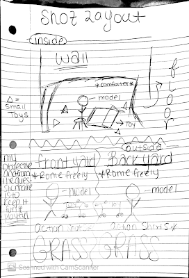
Ohana Sketch Layout- Production shot layout (RD)


Production shot layout


    Working with a toddler only allowed my shot layout to be more of a spontaneous event rather than extremely structured. I did plan however an indoor and outdoor shot where I would implement playful activity with each - of course with changes of scenery. The first was indoors, I wanted the focus of this shot to be of joy and play from the model; Very natural and realistic nothing to structured except for the placement in which the toys would be in the shot. The outdoor shots were located in house yards and I intended to showcase freedom, youth, and excitement each of which a child delivered without instruction.


Ohana Magazine - Camera Shots

 Camera Shots

The following are a few raw, unedited camera shots taken on a production day. Although I have yet to decided on which one I would be utilizing, after editing I should have an answer. These shots best portray freedom of youth which is why they were selected for this portion of my magazine. 

Ohana Table of contents Editing

 Editing

The following images are edits made before the final project of my table of contents page. Canva is the website mostly utilized during this magazine.

Items that were changed since 1st draft:

  1. Images
  2. Amount of pictures 
  3. Text/Font
  4. The editing of the actual images
  5. Colors
  6. Layout
The colors in which I planned to utilize for the background was the second color of the second column because it was a subtle color that wouldn't take away too much from the new images placed since my 1st draft.

The adjustments are as follows: enhanced the color quality (tint), the surrounding darkness to focus on the main image (vignette), the un-clarity of the image (blur), lighting of the image (brightness), the darkness of the image as well as the details of the image (saturation), and the quality of the image (contrast).

These filters allowed me to bring a color pop to the images and enhance them from the dull gray scale color that resonated over them. The model skin tone, clothing, and background were all enhance with color from this modification.

Realizations - The edits that were made to this table of contents were still not enough to bring forth the realism I desired. So, I utilized my findings from the cover page transformation for my new format of table of contents. I would not be able to use image as content anymore because I failed to find the niche that would work for me with that style of table of contents. I want my magazine o look real and if it did not look real because of my chosen style then I would need to replace it.  

I utilized this magazine because it would guide me towards a clear yet informational style of table of contents. As I produced my personal magazine I made sure to include elements that I liked and rejected the ones I didn't like to ensure that my magazine would be realistic, appealing and follow the audience desires. 

|Below are the drafts of my 3rd attempt at Table of Contents|
Attempt #1
Attempt #2
 
Attempt #1 was simply me trying to find a template that would look the most realistic. I found a template on Canva that mimicked the reference photo. Once I found that template, I was able to edit it as the reference and utilize my skills and background knowledge of color schemes and themes to construct my attempt #2. Afterwards I made a few modifications to make elements more vibrant, realistic, and appealing. - This will be found in my final project.


Ohana Sketch Layout - Table of Contents (RD)

  Table of Contents 

    The layout in which I chose for the table of content was "Image as content" which is the order of the magazine displayed through images. I chose this method of table of contents simply because I like the form of it, and find it more intriguing and playful which is a characteristic towards my magazine. Also working with a toddler allowed me to receive a mass amount of images ,so I am speaking honestly when I say that, I will not allow those images to go vain and will find a way to utilize it. Being as expressive with my production as I can be while correlating it to my content is a good fit for "Image as content" table of contents.


The Sketch appeared to me as simple to design once I were to go to Canva and design it. However once I began, I realized how difficult it would be to design it like the "Image as content" table of contents. This 1st attempt came out extremely disoriented and did not follow the path that I was going with. From this process, I have learned that I need to decrease the width of the image, change the background, align my page and subheadings, and find better images than what I've chosen.

Reference Picture

This was my attempt at a "Image as Content" table of content. I believe that this doesn't depict the best layout of a table of contents and looks more like a book rather that a magazine. Therefore, I must make alternations that would keep the "Image as content" alive but format it differently so that a content page can actually be seen. 


Wednesday, February 24, 2021

Ohana Model Choice

 Model Choices for Magazine 

Model: Santana Travis 

Age: 2 (Two)

Build: Short and Thin

Hair color: Dark Brown/ Black 

Eye Color: Dark Brown

Ethnicity: African - American 

Location: Cover and Table of Contents page


I chose Santana Travis to be the model of my family magazine because he was an efficient and easily accessible choice that fit the direction in which I wanted to go into with my magazine. Santana and I worked for the entire shooting production week and were able to get as much as we possibly could with the age difference of course. Santana was definitely eager to play and capture those free shots but it was difficult to keep him in certain poses for a certain amount of time. The images I was able to take of Santana are mostly him in action and taken on live photo so that I could slow down the filmed image and capture the best shot of him. (iPhone iOS option) 


Model: Destiny Felton
Age: 18 (Eighteen)  
Build: Tall and Thin
Hair color: Dark Brown/Black
Eye Color: Dark Brown 
Ethnicity: Caribbean and African - American 
Location in Magazine : Feature Story Page 

Destiny Felton was chosen as my feature story candidate being that I enjoyed her home life. Destiny is a fraternal twin to her brother Danny and the older sister of siblings who are not twins but born on the same day, different year. Destiny would naturally discuss her life as a twin and older sister of basically twins and the challenges and advantages the family took on. I have always found her family interesting and felt it was best to receive more of what that is like. Working with Destiny was awesome, Destiny was comfortable and extremely enthusiastic about working with me which showed in her descriptive answers. Overall, the content of her story is an interesting tale that her and I both believe will raise chins. 


Research - Color Scheme

Color Scheme

   Color Scheme plays such as vital role in a magazine. It adds on to the illustrations, context, and meaning behind the photographers target. Magazines that capture poses, positions, lightings, props, and other Mise-en-scene elements. Although a magazine cover color scheme will differ from its other pages, fluidity in the scheme can still be found if examined further. 

Tuesday, February 23, 2021

Production Calendar


Production Calendar 

The following production calendar will help me establish clear schedule in which I organize and manage the production aspect of my blogs. If followed things will be conducted in a efficient fashion and things will be according to my target with my magazine vision. 

Key - Production Calendar

PD: Production Day

ED:  Editing Day

RD: Revision Day


March 2021

Sunday

Monday

Tuesday

Wednesday

Thursday


28


1


2


3


4


7


8


9


10


11


-        Production Day (Setting up my idea of the images and testing them out)


14


15


16


17


18


-       Production/

Revision Day (ensuring if I need any more photos and take Behind the Scenes moments also)

-        Editing and Revision Day (Final straw before finishing)

-        Reviewing and Editing more (Just to be safe)

-        Should be Completely finish with all production


21


22


23


24


25


-        DUE DATE FOR PRODUCTION


28


29


30


31


1